Styling Error Messages
HTML form validations allow us to provide feedback to the user. When an input
doesn’t match the input type. Or fails any of the validation constraints, the
browser shows an error message.
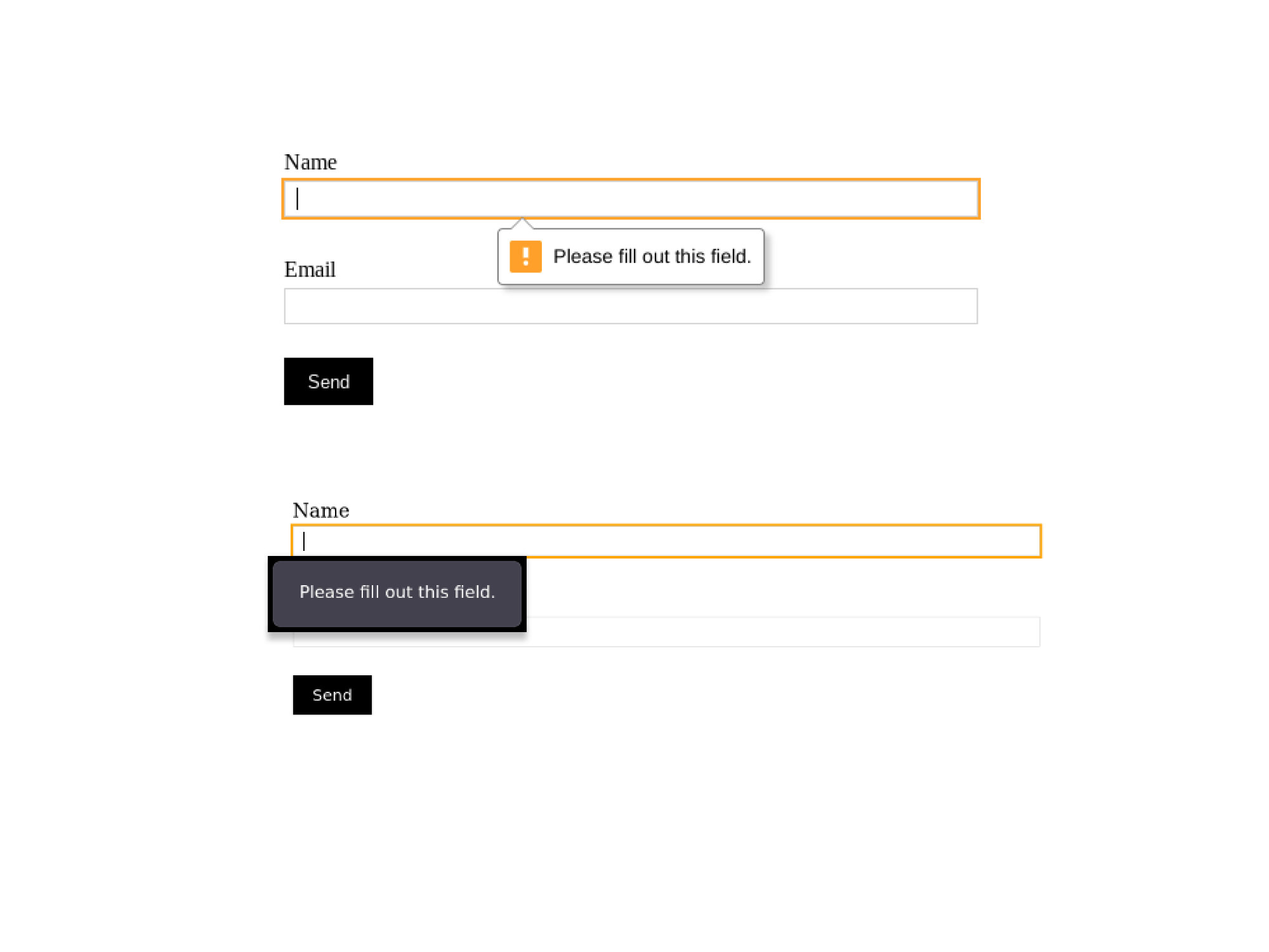
What I’m not a huge fan of, is how the browsers display error messages. And the fact that every browser displays them differently.
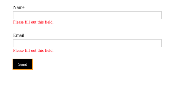
We usually want more control. We want to ensure everything is on-brand and cohesive with the rest of the design. This is what we’ll be exploring in this post. Specifically, how to use the Constraint Validation API, to customize the error messages.
Creating the form
For this example, we’ll be creating a login form. It has a username and password field:
<form action=”/login” method=”post”>
  <label for=”username”>Username</label>
  <input type=”text” name=”username” minlength=”6” maxlength=”24” pattern=”[A-Za-z]+ required”>
  <label for=”password”>Password</label>
  <input type=”password” name=”password” minlength=”8” required>
  <button>Login</button>
</form>
If you’re not familiar with regex, pattern=”[A-Za-z]+” on the username, might
look strange. It means we’ll only accept alphabetical characters. You can read
more about pattern on the mdn docs.
Okay so now, when we submit the form, we can see the error messages. But, we’re leaving the styling of the error messages to the browsers. Let’s change that.

Styling the error messages
The first thing we’re going to do is add an empty span under each input. This
is where we’ll show our error messages.
<input type=”text” name=”username” … >
<span class=”error-message” id=”usernameError”></span>
<input type=”text” name=”password” … >
<span class=”error-message” id=”passwordError”></span>
I’ve given the
spans an id of<input-name>Error, ex:usernameError. We’ll use it to select the element with JavaScript.
I’ve also gone ahead and added some basic styling.
input:invalid {
  border: 2px solid red;
}

.error-message {
  color: red;
}
When we submit the form, if any of the inputs are invalid, an invalid event is
emitted. We’ll use JavaScript to listen for that event and then display our
error messages.
const form = document.querySelector("form")
const inputs = form.querySelectorAll("input")

inputs.forEach(input => {
  const errorContainerID = `${input.name}Error`
  const errorContainer = document.getElementById(errorContainerID)
  input.addEventListener("invalid", (e) => {
    // Stop the browser from displaying the default error messages
    e.preventDefault()
    errorContainer.innerText = input.validationMessage
  })
})
validationMessage is a property which provides us with the error message.

Improve the handling of error messages
Okay so now we’ve got this working. There are a couple of improvements I’d like to make:
-
The error messages are currently only shown once the form is submitted. While this works, wouldn’t it be better to provide immediate feedback?
-
An error message is not cleared until the next form submission. So we will end up with valid input, still showing an error underneath it. This will confuse our users. We want to clear the error message as soon as the user tries correcting the input.
const form = document.querySelector("form")
const inputs = form.querySelectorAll("input")

inputs.forEach(input => {
  const errorContainerID = `${input.name}Error`
  const errorContainer = document.getElementById(errorContainerID)

  input.addEventListener("input", () => {
    /* When a user starts typing clear the error message */
    errorContainer.innerText = ""
  })

  input.addEventListener("blur", () => {
    /* When an input loses focus, check immediately for errors */
    input.checkValidity()
  })

  input.addEventListener("invalid", (e) => {
    e.preventDefault()
    errorContainer.innerText = input.validationMessage
  })
})
Okay now, this is looking much better. There’s one final thing I want to improve upon. The error messages themselves.
Custom error messages
Until now we’ve used the default error message provided by the browser:
errorContainer.innerText = input.validationMessage
Some of these can get quite verbose. One example: “Please lengthen this text to
3 characters or more (you are currently using 2 characters)”. Lets set a custom
message using the setCustomValidity().
We’ll make the changes in the invalid event handler.
input.addEventListener("invalid", (e) => {
  e.preventDefault()
  if(input.validity.tooShort) {
    input.setCustomValidity(`Please make sure the ${input.name} is at least ${input.minLength} characters`)
  }

  if(input.validity.tooLong) {
    input.setCustomValidity(`Please make sure the ${input.name} is not longer than ${input.maxLength} characters`)
  }

  errorContainer.innerText = input.validationMessage
})
We use validity to check the state of the input and why it failed. Then depending on the type of error, we set our custom message.
Summary
With a few sprinkles of JavaScript, we can progressively enhance form validation. Provide a better user experience. And style the error messages to match our design style.

