Designing Fluid Websites
When building layouts we often use four to five breakpoints. When in reality we know there are hundreds, if not thousands of different screen sizes. We optimize for these breakpoints. And make sure things do not look too squashed or stretched in-between.
Fluid layout design is a way of building layouts without the need for breakpoints. This may sound a bit abstract so let me explain with an example.
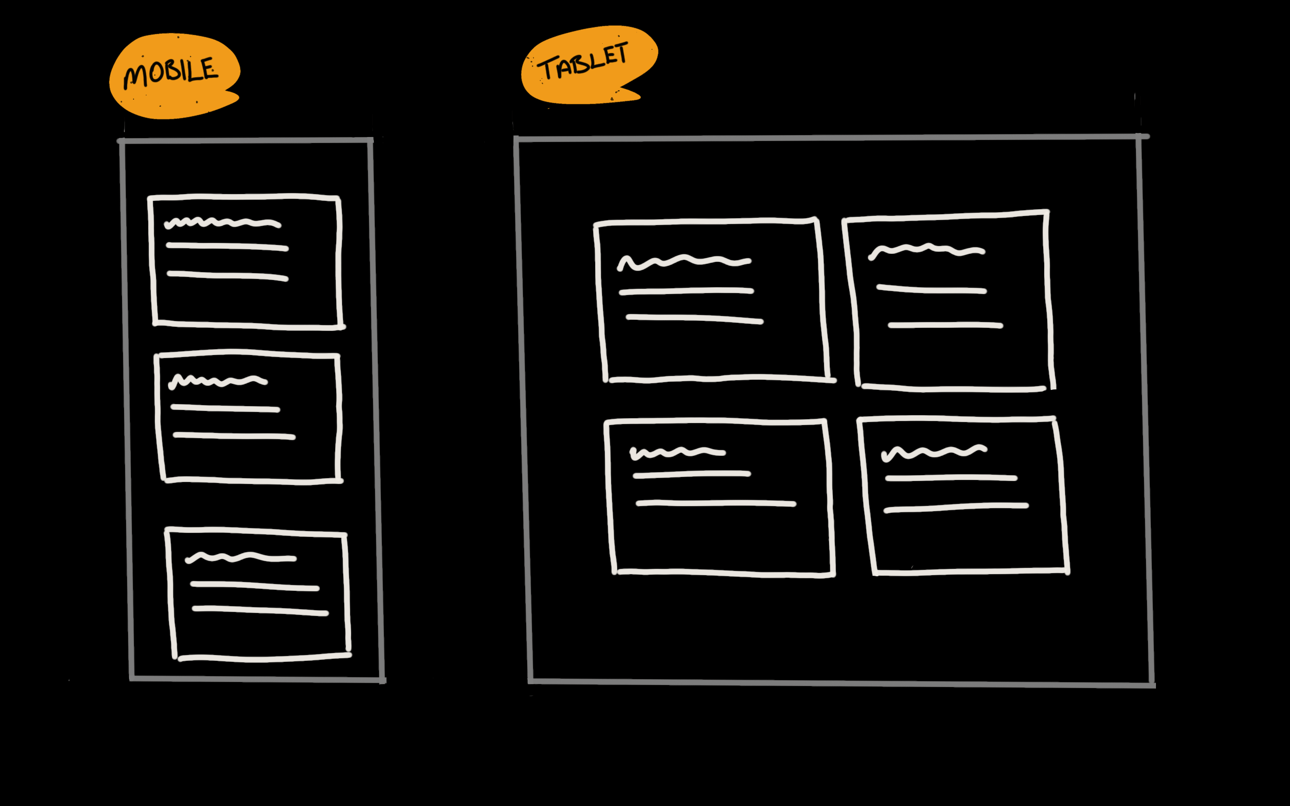
Let’s we want to create this layout.

We have a list of cards, each has a heading and a short paragraph. On mobile, we want them displayed in a single column. On larger devices we don’t want the card stretching too much, so we’ll go with a two-column layout.
Before, I would have taken this approach:
.card__list {
  display: grid;
  gap: 2rem;
}

@media (min-width: 768px) {
  .card__list {
    grid-template-columns: repeat(2, 1fr);
  }
}
I preview it, and if the paragraph feels a bit too squashed, I would change the
min-width to 1024px. But, this leaves me with an issue. On a device or
browser window at 1023px width, the card will look too wide. One way to solve
this is to eyeball it and use arbitrary breakpoints let’s say 992px. But this
is not always possible, nor desired. This is where “fluid design” comes into
play.
So in this case what I want is not to display two columns at 768px or
1024px. What I want is the card to not feel too squashed. And for that, I do
not want it displaying narrower than 40ch. Unless the display is smaller of
course.
And to show two or more columns when there’s enough space for each card to have
at least a width of 40ch. Here is an example of how we can achieve this using
fluid design:
.card__list {
  display: grid;
  gap: 2rem;
  grid-template-columns: repeat(auto-fill, minmax(40ch, 1fr));
}
This way we’ll let the browser determine (based on our instructions) when to
show one, two or more columns. We do not need to worry whether that will happen
at 768px, 992px or at any other width. We can assume that no matter the
display’s size, our content will still look good.
As Andy Bell says “Be the browser’s mentor, not the micro-manager”.
CSS is evolving at a crazy pace. A ton of new features will ship across all
browsers this year. The way we approach interface design will continue to
change. We’ll keep discovering new ways of doing things — better. And for
me ditching the media queries where possible is one of them. This, with the
soon to be available @container queries will open up the door to exciting
possibilities. I cannot wait.

