Create a modal using the dialog element

Up until a few months, when creating modals, we had no choice. You had to reach out to Javascript. You had to handle state, focus and accessibility, by yourself.
Thankfully as of a few months, the dialog element is now supported across all
modern browsers. Accessibility, focus trap and so many other things are built
into it. Let’s have a look at how to use it.
Creating the modal
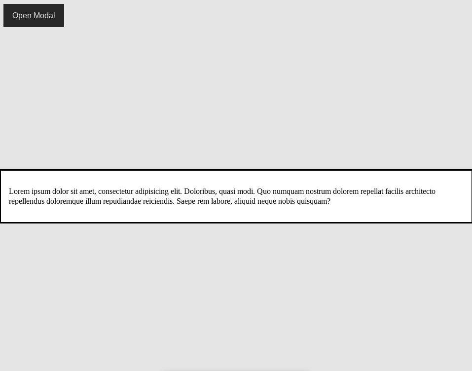
<button id="openModal">Open Modal</button>

<dialog id="exampleDialog">
  <p>
    Lorem ipsum dolor sit amet, consectetur adipisicing elit. Doloribus, quasi modi. Quo numquam nostrum dolorem repellat facilis architecto repellendus doloremque illum repudiandae reiciendis. Saepe rem labore, aliquid neque nobis quisquam?
  </p>
</dialog>
This leaves us with a button on the page. However, when you click it nothing happens. We’ll still need Javascript to open the modal. So let’s fix that.
const openBtn = document.getElementById("openModal")
const dialog = document.getElementById("exampleDialog")

openBtn.addEventListener("click", () => dialog.showModal())
Before showing you how to close the modal, I want you to notice how the focus is
trapped within the modal. You cannot click outside, and focus will remain
within the dialog no matter how many times you hit the tab key on your
keyboard.
Closing the modal
Hitting escape on your keyboard will close the modal. And that’s great, it’s
what we expect. However, it would be nice to have a button within the modal, to
close it as well.
<button id="openModal">Open Modal</button>

<dialog id="exampleDialog">
  <p>
    Lorem ipsum dolor sit amet, consectetur adipisicing elit. Doloribus, quasi modi. Quo numquam nostrum dolorem repellat facilis architecto repellendus doloremque illum repudiandae reiciendis. Saepe rem labore, aliquid neque nobis quisquam?
  </p>
  <button id="closeModal">Okay</button>
</dialog>
We’ve added a button before the closing </dialog> tag. On its own, this
doesn’t do much. To make it work we just need to add:
const closeBtn = document.getElementById("closeModal")

closeBtn.addEventListener("click", () => dialog.close())
And now we have an accessible, working modal without too much work. However it doesn’t look great, does it? Let’s style it a bit.
Styling the modal
There are two things I don’t like about our modal.
-
It stretches and shrinks to fit the content. Often ending taking the full width of the screen
-
The backdrop is a bit too light
Let’s fix the width issue.
dialog {
  width: min(90%, 60ch);
  margin-inline: auto;
}
This takes care of the width, and it turns out there’s a pseudo-element
::backdrop which lets us style the background.
dialog::backdrop {
  background: rgba(0, 0, 0, 0.6);
}
And this is how our modal is looking.
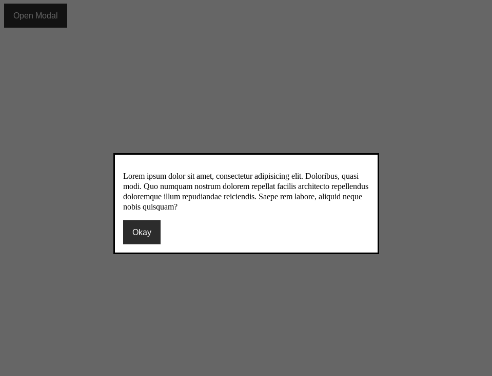
Okay, our modal won’t win any design awards. You can take it from here and style it as you would style any other element. You can add shadows, remove that border…
Final thing
Wouldn’t it be nice to be able to click anywhere outside of the modal, and have it close? This isn’t the default behaviour, so we’ll add a couple of lines of Javascript to make it work.
dialog.addEventListener("click", (e) => {
  if(e.target.nodeName === "DIALOG") {
    dialog.close()
  }
})
And that’s it! We’ve got a fully functioning modal, which offers a good user experience and which is accessible.